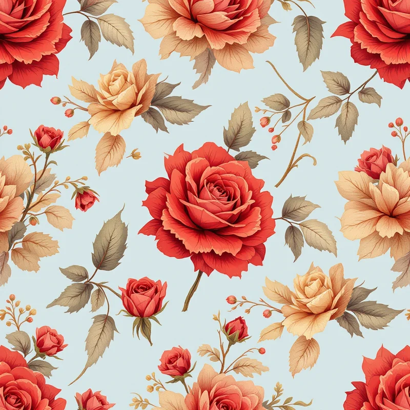
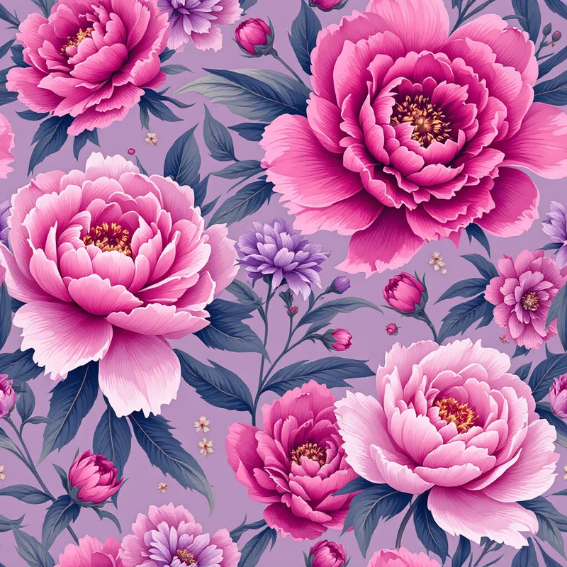
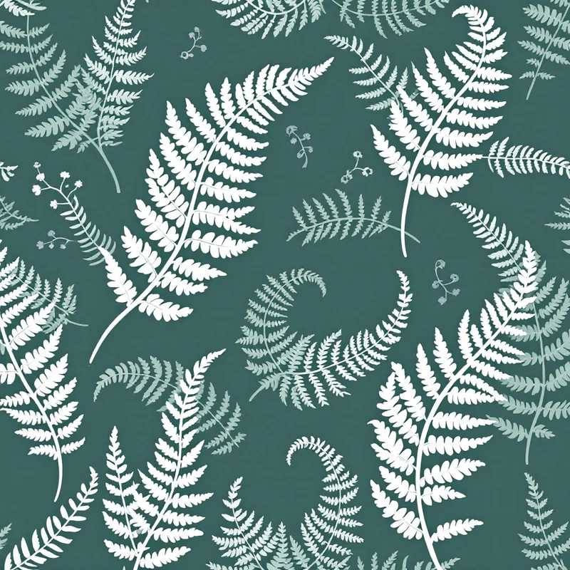
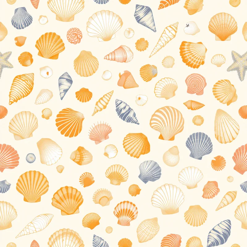
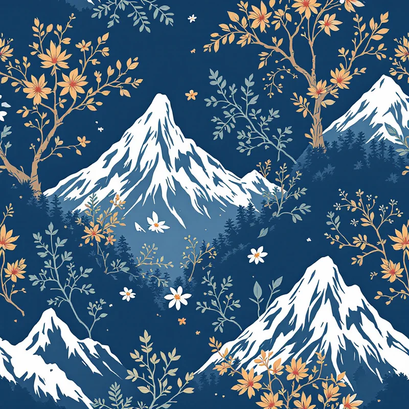
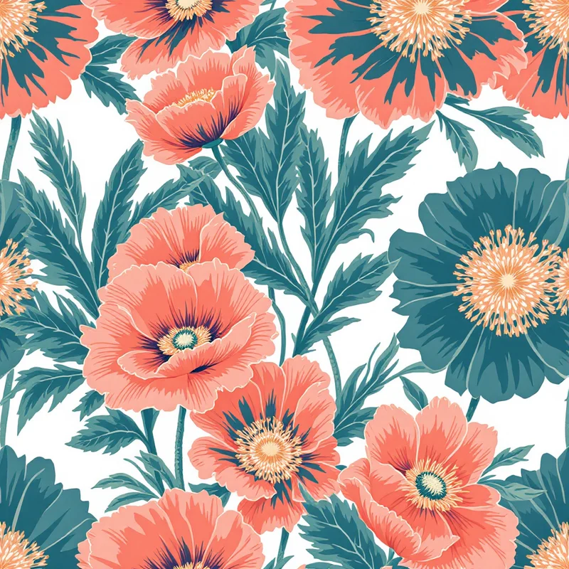
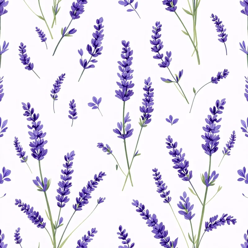
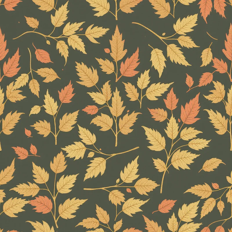
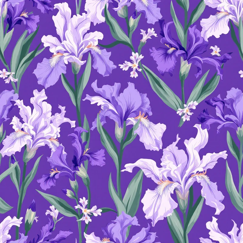
Matte, opaque color with a velvety finish that sits flat on the surface with absolute confidence. Your gouache patterns carry the rich, saturated pigment quality of designer's gouache — the medium of choice for mid-century illustrators, fashion designers, and surface pattern professionals for over a century. Every motif comes out with dense, even color, clean edges where paint meets background, and the distinctly matte surface that makes gouache unlike any other painting medium.
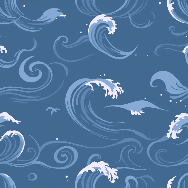
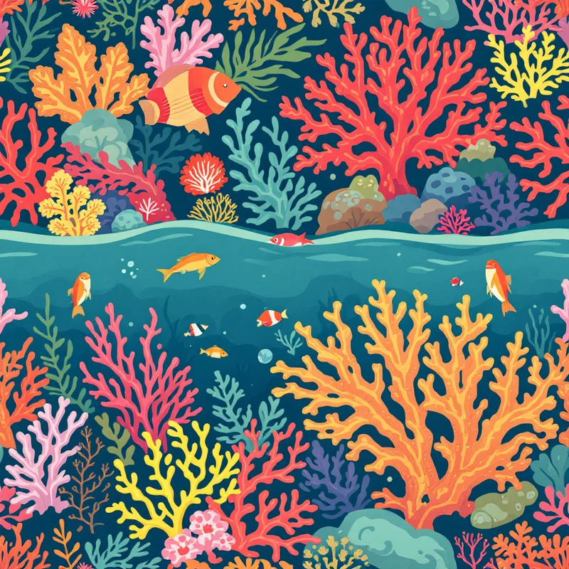
Gouache rendering produces a look that sits precisely between watercolor and acrylic — opaque like acrylic but without the plastic sheen, painterly like watercolor but without the transparency. This specificity is the rendering's greatest commercial asset. Apply it to botanicals for the rich, saturated florals you see in professional surface design portfolios. Use it on geometric motifs for crisp, hand-painted precision. Render food illustrations with the appetizing density of a cookbook plate. Try it on animals for bold, illustrative wildlife prints. Every category benefits from the flat, confident opacity.
In fashion, gouache-rendered patterns carry the visual authority of professional illustration. This is the rendering style that surface design studios have used to present fashion prints for decades — from Marimekko's bold graphics to Rifle Paper Co.'s lush botanicals. When your patterns look like professional gouache illustrations, they signal to buyers and art directors that you speak the visual language of the industry. That credibility translates into higher licensing fees and better placement.
For children's books, educational products, and illustrated merchandise, gouache is the gold standard rendering style. The flat, opaque colors reproduce consistently across print methods, the matte finish reduces glare in photography and on screen, and the illustrative quality feels warm and inviting without skewing too young. Children's clothing, nursery wall art, picture book merchandise, and educational materials all perform exceptionally well with this rendering.
Stationery and paper goods are another core market. The gouache aesthetic dominates premium stationery brands — greeting cards, gift wrap, planners, and notebooks with dense, matte painted motifs outsell most other rendering styles in this category. The flat, opaque color produces vibrant results on both coated and uncoated paper stocks, and the clean paint edges make text overlays and product layouts straightforward.
Home textiles in gouache rendering bridge the gap between illustration and interior design. Table linens, kitchen textiles, cushion covers, and tray designs with gouache-rendered patterns feel curated and designer-selected. The matte, flat quality integrates well with modern and mid-century interior styles where bold, confident graphic design is prized over painterly softness.
You control pigment density, color saturation, and edge sharpness across every design. Push opacity to maximum for poster-like flatness, or let a hint of brushwork show through for a more hand-painted character. Adjust your palette from bold primaries to muted earth tones — the matte finish makes every color feel grounded and intentional rather than glossy or artificial.
Export at up to 8K resolution with full color density and matte finish preserved. The flat, opaque quality means your patterns reproduce with remarkable consistency across substrates — what you see on screen matches what comes off the press. This predictability is invaluable for production work where color accuracy matters and reprints cost money.