

Surface pattern design is the discipline of creating decorative designs that are applied to surfaces — fabric, paper, ceramic, glass, plastic, and digital screens. Whether you sell through print-on-demand platforms, license to manufacturers, or work in-house for a brand, the professional workflow follows the same six phases.
Phase 1: Research and Brief
Every pattern starts with a question: who is this for and where will it be used?
Research the end customer, the product category, and the current market direction. Build a mood board of visual references — colors, textures, competing products, and inspirational imagery. Define your design brief with specific parameters:
- Style family — geometric, botanical, abstract, cultural, conversational
- Mood — playful, sophisticated, edgy, rustic, luxurious
- Color direction — warm earth tones, cool ocean blues, bold primaries, muted pastels
- End use — fashion fabric, home decor, packaging, digital product
- Price point — budget, mid-market, premium, luxury (this affects complexity and color count)
A clear brief prevents wasted iterations. The more specific you are upfront, the fewer dead-end designs you produce.
Phase 2: Color Development
Develop your color palette before designing motifs. Color sets the emotional tone of the entire pattern — changing it later means rethinking everything.
A professional palette typically contains 3 to 6 colors:
- One dominant (sets the overall mood, usually the background)
- One or two supporting (carries the main motifs)
- One accent (creates focal points and visual interest)
- One neutral (gives the eye a place to rest)
Test your palette on the intended substrate. Colors shift between cotton, silk, polyester, paper, and screen. If designing for physical printing, work in CMYK from the start. If designing for digital, RGB gives you a wider gamut.
Plan colorways from the beginning. A colorway is the same pattern in a different palette. Professional designers create 3 to 5 colorways per pattern: a trend-forward lead, a commercially safe neutral, and 2-3 seasonal or market-specific variants. Multiple colorways dramatically increase the commercial value of a single design.
Phase 3: Motif Design
Create or generate the individual elements that compose your pattern. Traditionally this means sketching, scanning, and digitizing by hand. With AI tools, it means describing what you want and iterating quickly through variations.
Whether handmade or AI-generated, each motif should work at the intended print scale. A rose that looks detailed and beautiful at 5cm on screen may become an unrecognizable blob at 1cm or a pixelated mess at 20cm.
Consider density early. The number and size of motifs relative to the background determines whether the pattern feels lush or airy, bold or subtle. Spacing between motifs is as important as the motifs themselves — uneven gaps create visual tension, even gaps create calm.
Phase 4: Tile Construction
This is where the repeat is built. The tile is a single rectangular unit that will be replicated across the final surface.
In the traditional workflow, designers use Illustrator or Photoshop to manually place motifs within the tile boundary and painstakingly match every element that crosses an edge. This can take hours for a complex botanical or conversational pattern.
AI pattern generators handle tile construction automatically. The algorithm generates a complete tile with matched edges in one step. For designers, this collapses what used to be the most time-consuming phase into seconds — freeing time for the creative decisions that actually matter.
Phase 5: Quality Control
Never skip this phase. Always preview your tile in a tiled grid — minimum 3x3, ideally 4x4 — before exporting.
Check for:
- Visible seams — color shifts or misaligned elements at tile edges
- Motif collisions — elements that crash into each other at tile boundaries
- Uneven distribution — clusters of motifs with empty gaps between them
- Rivers — channels of background that run through the tiled pattern, creating distracting visual lines
- Scale issues — preview at actual print size, not just screen size
If problems exist, fix them before export. The tiling correction tool can blend edge seams. For motif placement issues, regenerate with adjusted density or composition settings.
Phase 6: Export and Delivery
Export specifications vary by end use:
| Use Case | Resolution | Format | Color | Extras |
|---|---|---|---|---|
| Print-on-demand | 4K | PNG | RGB | Platform-specific DPI |
| Fashion textiles | 4K–8K | TIFF | CMYK | 300 DPI, bleed margins |
| Wallpaper | 8K | TIFF/PDF | CMYK | Manufacturer specs |
| Packaging | 4K+ | TIFF/PDF | CMYK | Bleed margins, dieline |
| Digital products | 1K–2K | PNG/JPG | RGB | Web-optimized |
Organize your files. For each pattern, save: the working file, the final tile in each colorway, and export versions for each intended platform. Name everything clearly — pattern name, colorway, resolution, and format. Future you will thank present you.
The Professional Edge
What separates professionals from hobbyists is not just design talent — it is process discipline. Following this workflow consistently means every pattern you produce is market-ready, properly formatted, and commercially viable. Whether you create one pattern a month or fifty, the same six phases apply.
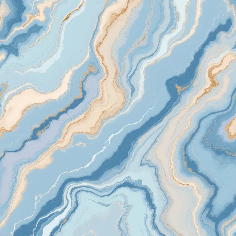
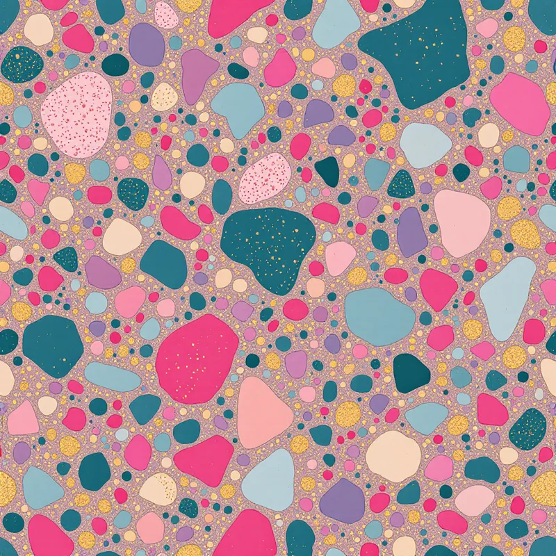
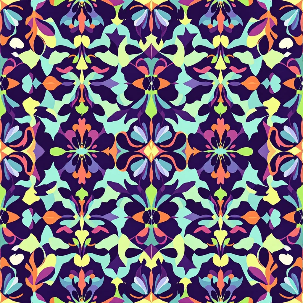
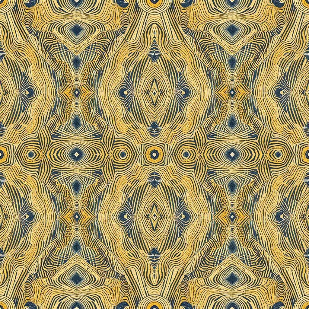
Explore related pattern styles

