

Sublimation printing turns solid dye into gas and bonds it directly into the fibers of polyester fabric, producing prints that are permanent, wash-resistant, and impossible to feel on the surface. Unlike screen printing or direct-to-garment, sublimation does not sit on top of the fabric -- it becomes part of it. This makes it the ideal process for all-over print garments where color and pattern cover every inch of the fabric, seam to seam.
Key takeaway: Design sublimation patterns in RGB (not CMYK) on white polyester, using seamless tiles at 300 DPI -- and always test print a physical swatch before committing to production, because screen colors and sublimation colors diverge more than you expect.
Designing patterns for sublimation requires understanding the process's specific constraints: its color behavior on polyester, its relationship with white, its file requirements, and its unique strengths for seamless repeat patterns. Get these right, and sublimation produces some of the most vivid, durable patterned garments possible.
How Sublimation Printing Works
The process has three steps. First, your pattern is printed in reverse onto transfer paper using sublimation inks (a special formulation that sublimates -- transitions from solid to gas -- under heat). Second, the printed transfer paper is placed face-down on polyester fabric and fed through a heat press at roughly 385 to 400 degrees Fahrenheit for 45 to 60 seconds. Third, the heat converts the ink to gas, and the gas penetrates the open pores of the polyester fibers (which also open under heat). When the fabric cools, the pores close, trapping the dye permanently inside the fiber structure.
This chemistry has direct implications for pattern design.
The White Problem
Sublimation inks are translucent, not opaque. They dye the existing fabric rather than coating it. This means white is not a printable color -- white areas in your design simply show the base fabric color. On white polyester, this works perfectly. On any other fabric color, white areas reveal the fabric underneath.
For pattern design, this means your patterns should be designed for white or very light base fabrics. If your design has a white background, it will look clean on white polyester. But designing a pattern with a white motif on a dark background requires that dark background to be printed as solid ink coverage, which works but uses more ink and can sometimes show slight color variation across large solid areas.
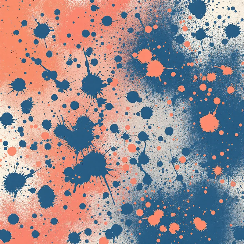
Many sublimation designers embrace this by working with patterns that have naturally light or white backgrounds -- scattered botanicals on white, pastel geometric grids, watercolor washes with white space. These designs are both aesthetically strong and technically cooperative with the sublimation process.
Designing Seamless Patterns for All-Over Print
All-over print garments -- where the pattern covers the entire surface of the shirt, dress, leggings, or jacket -- are where sublimation excels and where seamless patterns become essential.
Why Seamless Matters for Sublimation
The pattern is printed on flat fabric before the garment is cut and sewn. A seamless repeat tile covers the fabric from selvage to selvage and can extend to any length without visible interruption. If the pattern is not seamless, the tile boundaries will show as visible lines across the finished garment. On a t-shirt, these lines fall at unpredictable positions depending on how the pattern pieces are laid out on the fabric, making them impossible to hide.
With a properly seamless pattern, the entire garment surface reads as continuous pattern with no interruption, regardless of where the cut lines fall. This is the standard that buyers and print-on-demand platforms expect.
A dedicated pattern generator creates seamless tiles by default, which eliminates the most technically demanding step of sublimation pattern design. The generated tile can be repeated across any fabric width and length without additional seam correction.
Resolution and File Size
Sublimation printing requires high-resolution files. The standard is 300 DPI at the final print size. For a fabric width of 58 inches, a single tile does not need to span the full width -- a smaller tile that repeats cleanly is both easier to manage and more efficient to process.
A common approach: create a seamless tile at 300 DPI that is 12 to 18 inches square (3,600 to 5,400 pixels). The print software tiles this across the full fabric width automatically. Most RIP (Raster Image Processor) software used in sublimation printing has built-in tiling functions that repeat your file across the substrate.
For print-on-demand sublimation services, check the platform's template requirements. Many provide garment-specific templates (front panel, back panel, sleeves) at specific dimensions and DPI. Your seamless tile needs to fill each template panel without visible repeat boundaries.
File Format
PNG is the standard for sublimation design files. It supports lossless compression (no artifacts), transparency, and the RGB color space. JPEG introduces compression artifacts that can become visible in gradients and solid color areas -- avoid it for production files. TIFF is accepted by professional print houses but is not universally supported by print-on-demand platforms.
Color Management for Polyester
Sublimation color behavior differs from screen display and from other print methods. Understanding these differences prevents unpleasant surprises when your first sample arrives.
RGB, Not CMYK
Unlike traditional textile printing, sublimation design files should be in RGB color mode. Sublimation printers use CMYK inks internally, but the RIP software handles the conversion from your RGB file. Designing in CMYK and then having the RIP convert introduces a double conversion that can shift colors unpredictably.
Design in sRGB. What you see on a calibrated monitor will be reasonably close to the printed result, with the caveats below.
Color Vibrancy
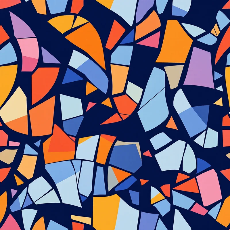
Sublimation on white polyester produces remarkably vivid colors -- often more saturated than screen printing or direct-to-garment. Bright reds, electric blues, vivid greens, and neon-adjacent shades print with an intensity that other processes struggle to match. This is a strength you can lean into when designing patterns. Bold, saturated palettes that might feel overwhelming in other print methods look right at home in sublimation.
However, very dark colors -- especially true blacks -- can be challenging. Achieving a rich, solid black requires heavy ink coverage from all four CMYK channels, and slight misregistration or incomplete transfer can produce a dark that looks more dark brown or dark green than true black. Some designers avoid large black areas or use very dark navy or charcoal instead.
Neon and Fluorescent Colors
Sublimation can produce neon-like vibrancy on polyester, but true fluorescent colors require special fluorescent sublimation inks, which most standard printers do not carry. If your pattern uses neon yellow, neon pink, or neon green on screen, the printed result will be vivid but not fluorescent unless you confirm that the printer uses fluorescent ink sets.
Fabric Texture Effects
Polyester fabric texture affects how the pattern reads. Smooth polyester (like performance athletic fabric) shows the most detail and color accuracy. Textured polyester (like jersey or mesh) softens fine details and slightly desaturates colors due to the irregular fiber surface catching light differently. Design with your fabric substrate in mind -- fine line work that looks crisp on smooth polyester may become fuzzy on textured knit.
Pattern Design Strategies for Sublimation
Certain pattern approaches work especially well with the sublimation process.
All-Over Repeats with No Dominant Direction
Patterns without a strong up or down orientation are ideal because the pattern pieces of a garment are cut at various angles. A tossed floral, a scattered geometric, or a rotational abstract motif looks correct regardless of the piece's orientation on the fabric. Strongly directional patterns (like patterns with clear vertical stripes or upright figurative motifs) require careful placement to avoid upside-down elements on some garment panels.
Medium Density
A pattern that is too sparse shows the base fabric as dominant, which can make the garment look under-designed. A pattern that is too dense can create visual weight that is overwhelming on a full garment. Medium density -- where the pattern motifs and background are roughly balanced -- tends to produce the most wearable results for apparel.
Color-Rich Palettes
Since sublimation excels at color reproduction, take advantage of it. Multi-color palettes with smooth gradients, watercolor effects, and complex color interactions print beautifully and differentiate your designs from the simpler palettes that screen printing imposes.
Scale Awareness
The same pattern tile reads differently on a phone case, a t-shirt, and a pair of leggings. A motif that is 2 inches across on a phone case becomes a subtle texture on a dress. Generate or adjust your pattern at a scale appropriate for the target product -- larger motifs for apparel, smaller repeats for accessories.
Common Sublimation Pitfalls
Ghosting occurs when the transfer paper shifts during pressing, creating a faint double image. This is a production issue, not a design issue, but patterns with sharp edges and high-contrast details make ghosting more visible. Soft, diffused patterns are more forgiving.
Banding appears as faint horizontal lines across gradients, caused by the printer head's pass pattern. It is most visible in smooth, slowly transitioning gradients. Adding slight texture or noise to gradient areas can mask banding if it is a persistent issue with your print provider.
Color shift between panels happens when front and back panels are printed in separate press cycles. Slight temperature or timing differences between presses can create visible color inconsistency at the seams. Ask your printer about their panel-matching process if color consistency across the garment is critical.
Workflow Summary
Design your seamless pattern tile in RGB at 300 DPI. Use the studio to generate seamless tiles that handle the repeat engineering automatically. Export as PNG. Test print a swatch before committing to a production run. Evaluate colors on the actual fabric substrate, not on screen. Adjust color intensity and pattern scale based on the physical sample. Once approved, your seamless tile can be tiled across any garment template or fabric width for production.
Start exploring pattern styles in the studio to build your sublimation design library.
Explore related pattern styles
Patterns for
