Packaging is one of the largest commercial applications for seamless patterns. A patterned box, bag, or wrapper does something that solid color cannot — it creates visual richness, communicates brand personality, and makes the product feel worth keeping. Here is how to use pattern design effectively in packaging.
Why Patterns Elevate Packaging
A plain white box is functional. A patterned box is an experience. Patterns add depth and texture that solid colors or simple logos cannot achieve. They turn packaging from something you discard into something you notice — and potentially keep.
Patterns also give brands a visual signature that is more flexible than a logo. A logo lives in one spot; a pattern covers every surface. It becomes part of the unboxing moment, the shelf presence, and the social media photo. For D2C brands competing on Instagram and TikTok, patterned packaging is a significant competitive advantage.
Matching Pattern to Product
The pattern must serve the product and its audience:
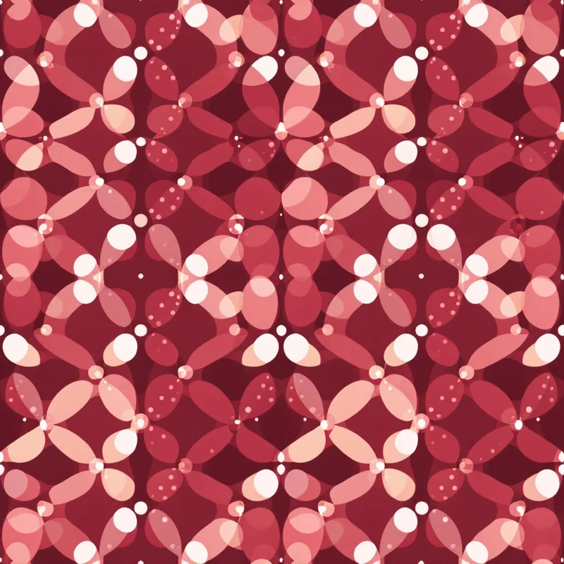
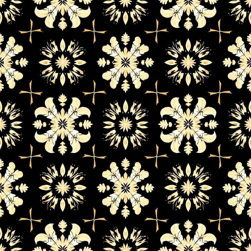
- Luxury goods — subtle tone-on-tone geometrics, monogram repeats, or fine damask. Low contrast, premium feel. Think jewelry boxes, high-end cosmetics, and spirits.
- Food and beverage — related motifs like citrus fruits, herbs, coffee beans, or grain patterns. The pattern reinforces what is inside.
- Children's products — playful animals, stars, rainbows, and bright shapes. High energy, high saturation.
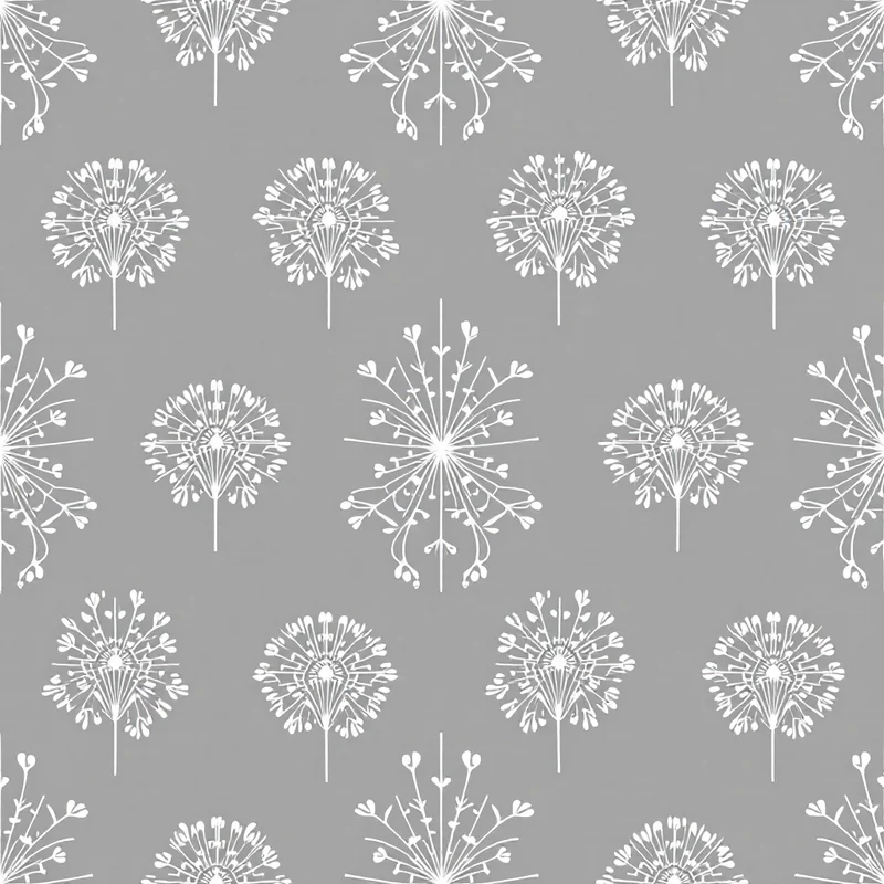
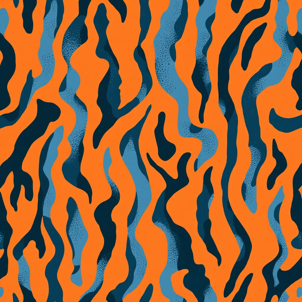
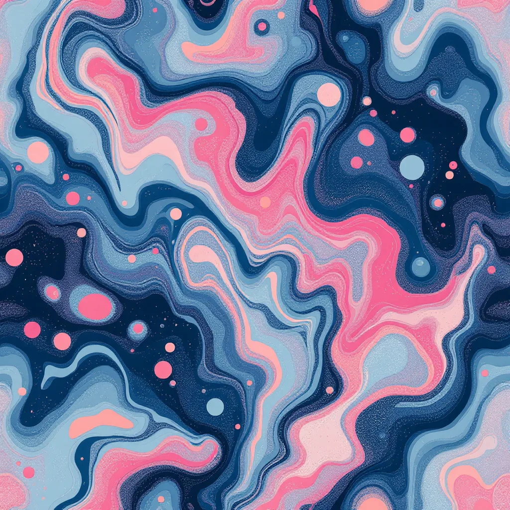
- Fashion and beauty — florals, abstract textures, and trending styles that signal taste and currency.
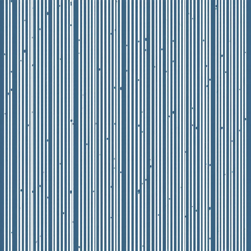
- Corporate gifts — clean geometric patterns in brand colors. Professional without being sterile.
- Eco-conscious brands — organic textures, botanical line art, earth-toned patterns on kraft paper. The pattern signals the brand values.
Color Strategy for Print
Color count directly affects production cost. Every additional color in a screen-printed pattern increases the price. For most packaging patterns, 2 to 4 colors is the sweet spot — enough for visual interest, manageable for production.
Consider the substrate. Your pattern will be printed on a physical material — white card, kraft paper, metallic foil, clear film — and that material becomes part of your color palette. A two-color design on kraft paper is effectively a three-color design because the brown of the kraft shows through.
Always work in CMYK from the start if the pattern will be offset-printed. Colors that look vibrant in RGB on screen can shift dramatically when converted to CMYK for print. Request a press proof before committing to a full production run.
Print Specifications
Export your pattern tile at minimum 300 DPI at actual print size. For packaging, this typically means 4K resolution or higher. Include bleed margins — usually 3mm to 5mm beyond the trim edge — so the pattern extends past the cut line. No white edges.
Preferred file formats for packaging printers:
- TIFF — lossless, supports CMYK, the industry standard
- PDF — vector-compatible, some printers prefer this
- PNG — acceptable for digital printing, RGB only
If your packaging uses spot colors (Pantone), work with your printer to set up the correct color separations. AI-generated patterns are raster-based, so discuss with your printer whether they need vector conversion.
Getting Scale Right
Scale is the most common packaging mistake. A pattern that looks great on a flat screen may look completely wrong when wrapped around a three-dimensional box.
The motifs on a small cosmetic box need to be much smaller than the motifs on a large shipping box. A pattern with 10cm flowers looks impressive on a wallpaper roll but absurd on a lip balm package.
Always mock up your pattern on the actual packaging template before production. Check how it looks on every face — front, sides, top, and bottom. Check what happens at corners where surfaces meet. Consider whether the pattern needs to align across faces or whether a random tiled placement is acceptable.
Tissue Paper and Inner Wraps
One of the highest-impact uses of patterned packaging is internal tissue paper or wrapping. This is the first thing the customer sees when they open the box. A branded tissue wrap in a coordinating pattern elevates the perceived value of the product significantly. Because tissue is printed at lower resolution than boxes, you can use simpler patterns — logos, small geometrics, or single-color botanicals.
Getting Started
The fastest path from concept to print-ready pattern is AI generation. Describe your brand aesthetic, pick a style that matches your product category, set your brand colors, and generate. Export at high resolution with bleed margins and send directly to your printer. The entire workflow from concept to file takes minutes, not days.
Explore related pattern styles
Patterns for

