Minimalist pattern design is deceptively difficult. Removing elements from a pattern is harder than adding them, because every remaining element carries more visual weight. In a dense botanical print, a slightly awkward motif spacing gets lost in the complexity. In a minimalist pattern, that same spacing error becomes the first thing anyone notices.
The best minimalist patterns feel inevitable — as if no element could be added or removed without breaking the design. Achieving that takes more deliberate decision-making, not less. Here is how to approach minimalist pattern design with the precision it demands.
Core Principles of Minimalist Patterns
Negative space is a design element
In minimalist patterns, the background is not empty space waiting to be filled. It is an active participant in the composition. The proportion of negative space to motif defines the pattern's character as much as the motifs themselves.
A common ratio for effective minimalist patterns is 60-75% negative space. Below 60%, the pattern starts feeling cluttered and loses its minimal quality. Above 80%, it risks looking unfinished or like a texture rather than a deliberate pattern.
The shape of the negative space matters too. In a well-designed minimal pattern, the gaps between motifs form their own coherent shapes. If you squint at the pattern and the negative space looks random, the composition needs adjustment.
Limited palette, maximum intention
Minimalist patterns typically work with 2-4 colors including the background. Each color addition increases visual complexity exponentially because it creates new color relationships and contrast points.
- Two colors (motif + background): Maximum simplicity. Works for geometric patterns where the form itself carries visual interest. Think black line work on white, or a single warm tone on cream.
- Three colors (two motifs/values + background): The sweet spot for most minimalist designs. Allows hierarchy — a primary motif color and a secondary accent — without overwhelming the composition.
- Four colors: The practical ceiling for minimalist work. Beyond four, you are designing a pattern that uses simple motifs, which is different from designing a minimalist pattern.
Geometric simplicity and precision
Minimalist patterns favor basic geometric forms: circles, lines, dots, simple curves, elemental shapes. Complex or ornate motifs contradict the minimalist intent. This does not mean the geometry must be rigid — organic minimalism using hand-drawn lines and imperfect circles is a strong subcategory — but the underlying forms should be reducible to simple descriptions.
Precision in spacing and alignment is critical. In a dense pattern, slightly inconsistent spacing creates organic charm. In a minimalist pattern, inconsistent spacing creates the impression of carelessness. Grid-based placement, consistent margins, and deliberate rhythm are non-negotiable.
Where Minimalist Patterns Outperform
Minimal patterns are not just an aesthetic preference — they solve specific design problems better than complex patterns in several important contexts.
Modern interiors and wallpaper
The contemporary interior design market has shifted decisively toward patterns that add texture without visual noise. Minimalist wallpaper patterns work in spaces where a busy pattern would compete with furniture, art, and architectural features. A subtle geometric grid or spaced dot pattern adds warmth to a wall without dominating the room.
This is why minimalist patterns command premium pricing in the wallpaper market. Buyers spending $80-200 per roll want patterns that enhance a space for years, not designs they will tire of in six months. Restraint has longer visual shelf life.
Premium packaging
Luxury brands gravitate toward minimalist patterns because visual simplicity signals confidence. A brand that uses a dense, busy pattern on its packaging is working hard to get your attention. A brand that uses a spare geometric motif on quality paper stock is communicating that the product speaks for itself.
Effective minimalist patterns for packaging typically use:
- A single repeating motif (monogram, geometric element, brand-specific icon)
- Tone-on-tone color (embossed or subtly contrasted, not high contrast)
- Generous spacing that lets the substrate material contribute to the design
This approach works for cosmetics, spirits, artisanal food, jewelry, and any category where premium positioning matters.
Tech and digital branding
Digital interfaces demand patterns that function at multiple scales and do not compete with content. Minimalist patterns work as website backgrounds, app textures, presentation templates, and social media frameworks precisely because they add visual interest without creating cognitive load.
The technical advantage is real too: simple patterns with fewer colors produce smaller file sizes, render faster, and scale more predictably across devices.
Textile and fashion applications
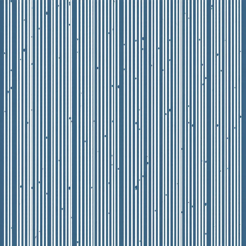
In fashion, minimalist patterns have carved a durable niche that transcends seasonal trends. Simple geometric patterns — fine stripes, micro dots, subtle grid textures — function as "elevated neutrals" that pair with more complex garments and accessories. A minimalist patterned shirt works under a blazer where a maximalist print would clash.
For home textiles, minimalist patterns work for items that serve as backdrop rather than focal point: bedsheets, curtains, tablecloths, upholstery for seating that needs to coordinate with bolder pillows or throws.
Common Mistakes in Minimalist Pattern Design
Too sparse: the "accident" problem
The most frequent mistake is reducing a pattern so aggressively that it no longer reads as intentional. If your motifs are so widely spaced that a viewer needs to see a large area of the pattern to recognize the repeat, you have crossed from minimalist into sparse. The pattern should be identifiable as a deliberate repeat within a reasonable viewing area — typically within 2-3 repeat units.
Test this by showing someone a cropped section of your pattern that includes 2-3 repeats. If they cannot tell it is a repeating pattern, it is too sparse.
Too busy: minimal motifs, maximalist layout
The opposite error. Using simple geometric motifs does not automatically make a pattern minimalist if you pack them densely. A tight grid of circles at 90% coverage is a dense pattern that happens to use a simple motif. True minimalist design requires restraint in density as well as form complexity.
Ignoring rhythm and cadence
Minimalist patterns need internal rhythm more than complex patterns do. When a viewer's eye has less to process, it processes what is there more carefully. Irregular or unclear rhythm in motif placement becomes uncomfortable in a way that goes unnoticed in busier designs.
Establish a clear rhythmic structure: regular grid, consistent offset, predictable alternation. The rhythm can be complex (a compound grid with primary and secondary elements) but it must be coherent.
Choosing "simple" colors lazily
"Minimalist" does not mean "black and white." While monochrome is a valid minimalist palette, defaulting to black and white without considering alternatives is a missed opportunity. Some of the most effective minimal patterns use:
- Warm neutrals: cream, sand, terracotta, warm gray
- Muted tones: dusty rose, sage, slate blue
- Tone-on-tone: two values of the same hue (dark navy on medium navy, for example)
The color choice should be as intentional as every other design decision.
Color Strategies for Minimal Patterns
Tone-on-tone
Using two closely related values of the same hue creates patterns that reveal themselves gradually. From a distance, they read as a textured solid. Up close, the pattern emerges. This approach is extremely effective for wallpaper and premium packaging where subtlety is the goal.
The key is getting the contrast ratio right. Too little contrast and the pattern disappears entirely. Too much and it loses the tone-on-tone effect. Aim for a contrast ratio between 1.5:1 and 3:1 — enough to be perceptible in person but not jarring.
High contrast, low density
The alternative approach: use bold contrast (black on white, navy on gold) but with generous spacing. This creates patterns with strong graphic presence that still feel minimal because the negative space dominates. This works well for branding applications where the pattern needs to be recognizable and memorable.
The neutral + accent formula
A monochrome base pattern with a single accent color used sparingly is effective for designs that need to feel minimal but also have a point of visual interest. For example, a gray line grid with one intersection point highlighted in copper. The accent color should appear in less than 15% of the motif area to maintain the minimal quality.
Creating Minimalist Patterns Effectively
Start with more, then subtract. It is easier to design a pattern with adequate density and then remove elements until you reach the minimum viable complexity than to start sparse and add. Each subtraction is a decision about what is essential — that process produces better results than additive building.
When working in Pattern Weaver, use the density slider at lower values (15-35%) and the scale slider at higher values (60-80%) to push toward minimal compositions. Pairing a geometric style with a limited palette and lower density gives you a strong starting point that you can refine.
Test your minimalist pattern at its intended scale on its intended product. A pattern that looks perfectly minimal on screen at 100% might feel too sparse printed on a full duvet cover, or too dense on a phone case. Scale and context determine whether the minimalism is working. Always verify at the scale that matters.
Explore related pattern styles

