AI image generation has become genuinely useful for surface pattern design. Not just as a novelty — as a real production tool that working designers are incorporating into their workflows. But the conversation around AI patterns tends to swing between breathless hype ("create a thousand patterns in an hour!") and dismissive skepticism ("AI cannot replace real design skill"). The reality is more interesting and more nuanced than either camp suggests.
This guide is for designers who want to understand how AI pattern generation works at a practical level, what the different tools can and cannot do, and how to get good results regardless of which tool you choose. Whether you are a textile designer exploring AI for the first time or a print-on-demand seller building a catalog, this should give you a solid foundation.
How AI Image Generation Creates Patterns
To use these tools well, it helps to understand what is happening under the hood — not at a PhD level, but enough to know why some approaches produce better patterns than others.
Most AI image generators run on diffusion models. The core idea is straightforward: the model starts with pure noise (random static) and gradually removes that noise, step by step, until a coherent image emerges. At each step, the model predicts what the final image should look like and nudges the noisy image a little closer to that prediction. The process is guided by a text prompt or structured input that tells the model what kind of image to produce.
Models like Stable Diffusion and DALL-E are all variations on this approach, trained on massive datasets of images paired with text descriptions. When you ask for a "watercolor floral pattern," the model draws on everything it learned about watercolor, florals, and patterns during training to guide the denoising process toward an image that matches.
Here is where patterns get tricky: standard image generation does not produce seamless tiles by default. A diffusion model generating a "floral pattern" will create an image that looks like a pattern, but the left edge probably will not match the right edge, and the top will not match the bottom. If you tile that image in a grid, you get visible seams.
Different tools solve this problem in different ways:
- Prompt-based tiling flags. Midjourney's `--tile` flag and similar prompts in other tools instruct the model to make the edges match. This works sometimes, but the results are inconsistent — the model is trying to satisfy the tiling constraint and the aesthetic prompt simultaneously, and one often suffers.
- Post-processing seam fixing. Generate a pattern image, then use inpainting to fix the border regions so edges match. This is more reliable than prompt flags but adds an extra step and can introduce artifacts in the border areas.
- Tiling built into the generation pipeline. Some specialized tools enforce tiling constraints at the model level during generation, so the output is seamless by construction rather than by correction. This tends to produce the cleanest results.
Understanding this distinction matters because it directly affects your workflow and the consistency of your output.
The Tools: What Each One Does Well
There is no single "best" AI pattern tool. Each option has strengths and limitations, and the right choice depends on your workflow, your skill level, and what you are trying to produce.
Midjourney
Midjourney is a general-purpose AI image generator with a `--tile` flag that enables seamless tiling. Its strength is aesthetic quality — Midjourney produces gorgeous images with distinctive artistic character. The model has a strong sense of color, composition, and mood.
For patterns: The `--tile` flag works reasonably well for simple, organic patterns — scattered florals, abstract textures, and loose geometric arrangements. It struggles more with structured repeats, precise symmetry, and consistent motif density. You will get some beautiful tiles and some that need significant post-processing to tile cleanly.
Workflow: You write text prompts in Discord (or the newer web interface), add `--tile` to enable tiling, and generate variations. It is a prompt-driven workflow, so the quality of your results depends heavily on your prompt-writing skill.
Best for: Designers who are comfortable with prompt engineering and want the artistic flexibility of a general-purpose image model. Good for one-off hero patterns where you are willing to spend time refining.
DALL-E (via ChatGPT or API)
OpenAI's DALL-E generates images from text prompts through ChatGPT or the API. It does not have a dedicated tiling mode, but you can prompt it to create seamless tileable patterns and sometimes get usable results.
For patterns: The tiling consistency is less reliable than Midjourney's `--tile` flag. DALL-E's strength is in following detailed descriptive prompts accurately. If you describe a specific composition in detail, it does a good job of producing something close to what you described. But achieving clean seamless tiling requires iteration and often manual post-processing.
Best for: Quick concept exploration and mood boarding. Less suited for production-quality seamless tiles without additional work.
Adobe Firefly
Adobe's generative AI, integrated into Photoshop and available as a standalone tool. Firefly is trained on Adobe Stock and licensed content, which is relevant for commercial use — Adobe explicitly positions Firefly as commercially safe.
For patterns: Firefly's Generate Pattern feature (in Photoshop) is specifically designed for seamless patterns and works well within the Adobe ecosystem. You can generate patterns, adjust them with Photoshop's editing tools, and export in any format. The integration with Photoshop is a real advantage for designers who already work in that environment.
Best for: Designers already in the Adobe ecosystem who want AI generation as part of their existing Photoshop/Illustrator workflow. The commercial licensing clarity is also a plus for anyone selling patterns commercially.
Stable Diffusion (via ComfyUI, Automatic1111, etc.)
Stable Diffusion is an open-source model that you can run locally or through various interfaces. With the right setup — tiling-enabled models, ControlNet for structure, custom workflows — it is extremely powerful and flexible.
For patterns: The most capable option for technical users. Custom ComfyUI workflows can enforce seamless tiling at the model level, control symmetry, manage density, and produce extremely consistent results. But the learning curve is steep. Setting up a reliable pattern generation pipeline in Stable Diffusion requires real technical knowledge.
Best for: Technical users who want maximum control and are willing to invest time in building custom workflows. Not practical for designers who just want to generate patterns without infrastructure work.
Dedicated Pattern Tools
A dedicated pattern generator is built specifically for surface pattern design rather than general image generation. Instead of writing free-form text prompts, you work with structured inputs — selecting a style family, substyle, color palette, density, scale, and render method. The tool translates those selections into optimized generation instructions behind the scenes.
For patterns: The main advantage is consistency and production reliability. Because these tools are designed specifically for seamless pattern generation, tiling works out of the box, the output parameters match industry specifications, and you do not need to learn prompt engineering. The tradeoff is less creative flexibility than a general-purpose tool — you work within the tool's style taxonomy rather than describing anything you can imagine.
Best for: Designers and sellers who need consistent, production-ready output without prompt-writing expertise. Especially useful for building catalogs where you need reliable quality across dozens or hundreds of designs.
What Makes a Good AI-Generated Pattern
Regardless of which tool you use, the same principles separate a good AI pattern from a mediocre one. These are the things to evaluate and optimize for.
Clean seamless tiling
This is the single most important technical requirement. A pattern that does not tile cleanly is not a usable pattern — it is just an image. Always check your output in at least a 3x3 repeat grid before considering it finished. Look for:
- Visible seams — color shifts, line discontinuities, or hard edges at the tile boundaries.
- Motif collisions — elements that get awkwardly cut off or create unnatural clusters where tiles meet.
- Density imbalance — the center of the tile being more densely filled than the edges, creating a visible grid when tiled.
If your tool does not produce clean tiles automatically, inpainting the border regions is usually the fastest fix. Photoshop's generative fill, or dedicated seam-fixing tools, can repair border issues without redoing the entire generation.
Consistent motif density
A well-designed pattern has even visual weight across the entire tile. When repeated, the eye should flow across the pattern without getting stuck in dense clusters or lost in empty voids. Many AI generators struggle with this — they tend to pile motifs in the center and leave the edges sparse.
If you are working with a prompt-based tool, explicitly mention "evenly distributed" or "consistent density" in your prompt. If you are using a tool with density controls, experiment with the settings and always verify the result in a tiled preview.
Intentional color harmony
AI models can produce some genuinely beautiful color combinations, but they can also produce clashing messes. The difference between a sellable pattern and a forgettable one often comes down to the color palette.
A few principles that hold true regardless of tool:
- Limit your palette to 3-5 colors for most commercial patterns. More than that and the design starts to feel chaotic. Fewer gives you a cleaner, more sophisticated result.
- Use a dominant-accent structure. One or two colors should cover most of the area, with one or two accents for contrast and interest. If every color fights for attention equally, nothing stands out.
- Check how colors interact in the repeat. A color that looks fine in a single tile can become overwhelming when it appears four times in a 2x2 grid. Always preview in repeat before finalizing.
Some tools let you specify exact color palettes. Others infer colors from your prompt. Either way, be intentional about color — it is the fastest way to elevate or ruin a design.
Appropriate scale and density for the end use
A pattern that looks beautiful on screen at 100% zoom might be completely wrong for its intended application. Small-scale patterns with fine detail get lost on large products like duvet covers. Large-scale bold patterns can be overwhelming on small products like phone cases.
Think about the end use before you generate:
- Textiles and fashion: Medium to large scale, moderate density. The pattern needs to read well at arm's length.
- Stationery and packaging: Small to medium scale, moderate to high density. The pattern is seen up close.
- Wallpaper and interiors: Large scale, lower density. The pattern fills an entire wall and needs breathing room.
- Digital and web: Flexible, but beware of patterns that create visual noise at small screen sizes.
Authentic style rendering
This is the subtle one. The best AI patterns do not just depict a motif — they feel like they were made using a specific technique. A watercolor botanical pattern should have soft edges, color bleeds, and granular texture. A linocut geometric pattern should have the bold contrast and carved-edge quality of an actual block print.
Prompt-based tools need detailed descriptions of the rendering style to get this right. Mentioning "watercolor" alone might give you watercolor colors on a flat digital illustration. Adding "visible paper texture, soft wet-on-wet color bleeds, slight granulation" gets much closer to authentic watercolor rendering. The more specific you are about the technique — not just the subject — the more convincing the result.
Understanding Repeat Layouts
A seamless tile is the raw material. The repeat layout is how that tile is arranged across a surface. The choice of layout dramatically changes how the pattern reads, even when the tile itself is identical.
Straight grid (block repeat). Tiles placed edge to edge in a simple grid. This is the most basic layout and works well for patterns with built-in symmetry — geometric patterns, checks, stripes. For organic patterns like florals, a straight grid can make the repeat too obvious.
Half-drop repeat. Every other column shifts down by half a tile height. This is the industry standard for most commercial textile patterns because it disguises the repeat unit. The eye has a harder time finding where the pattern starts and stops, which makes the overall design feel more natural and flowing.
Brick repeat (half-brick). The horizontal equivalent of a half-drop — rows offset by half a tile width, like bricks in a wall. Works well for patterns with horizontal orientation or wide motifs.
Mirror repeat. Alternating tiles are reflected, creating automatic symmetry. This is the go-to for damask patterns, art deco designs, and traditional woven textiles where symmetry is part of the style.
Most end uses call for a half-drop repeat. If you are new to pattern design, start there — it works well for nearly everything and is the default choice in most textile production workflows.
Exporting for Different Use Cases
Getting the creative part right is only half the job. If you export at the wrong resolution, format, or color profile, the pattern will not perform as intended.
For digital use (websites, apps, social media): 1K to 2K pixel resolution, PNG or WEBP format, RGB color. Keep file sizes manageable — WEBP gives you excellent quality at smaller sizes than PNG.
For print-on-demand (Etsy digital downloads, Spoonflower, Redbubble): 4K resolution (4096x4096 pixels), 300 DPI, PNG format, RGB color. Check each platform's specific upload guidelines, but this covers most cases.
For professional fabric printing: 4K to 8K resolution, 300 DPI, TIFF format, CMYK color profile. The switch from RGB to CMYK can shift colors significantly — blues get duller, bright greens shift — so always proof the CMYK version before sending to production.
For wallpaper and large-format printing: 8K resolution (8192x8192 pixels), 300 DPI, TIFF or PDF. Include bleed margins (typically 3-5mm) to prevent white edges from slight cutting misalignment.
If your AI tool does not generate at high enough resolution for your use case, AI upscaling tools can increase resolution while preserving detail. Many pattern tools include built-in upscaling for this reason.
Tips for Getting Better Results
After spending a lot of time generating patterns across various tools, here is what I have found makes the biggest practical difference.
Be specific about the substyle, not just the category. "Geometric" is a starting point. "Hexagonal honeycomb with thin lines and slight dimensional shading" is a destination. The more specific your input — whether it is a text prompt or a style selection — the more distinctive and usable the output.
Iterate fast, then refine slow. AI's superpower is speed of exploration. Generate 10 variations in a few minutes, quickly reject the weak ones, then spend your time refining the one or two strongest results. Do not try to get a perfect pattern on the first generation — treat each generation as a sketch.
Test every pattern in a repeat grid. I know I keep saying this, but it bears repeating because it is the single most common mistake. A tile that looks average on its own can create a beautiful rhythm when repeated. And a tile that looks stunning on its own can reveal ugly problems when tiled. Always check the repeat.
Explore render methods. The same motif in watercolor versus vector flat versus ink illustration versus linocut can look like four completely different patterns. If you like a concept but the result feels flat, try a different rendering approach before changing the design.
Pay attention to negative space. Dense, maximalist patterns have their place, but many of the most commercially successful patterns have generous breathing room. Negative space lets the motifs speak and makes the pattern more versatile across applications.
Build on what works. When you find a pattern that performs well — either commercially or just aesthetically — create variations. Change the colorway. Adjust the scale. Try a different rendering style. A proven design concept in multiple variations is a more reliable catalog strategy than constantly chasing entirely new ideas.
Popular Pattern Categories to Explore
If you are new to AI pattern generation and want to start with styles that have strong commercial demand:
- Botanical patterns — the largest category in surface design. Florals, leaves, vines, and branches. Endless demand across fashion, home textiles, stationery, and gift wrap.
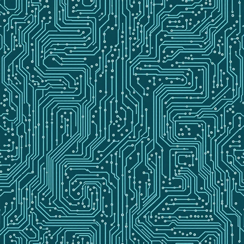
- Geometric patterns — clean, structured designs for modern interiors, menswear, tech branding, and stationery. Hexagons, chevrons, tessellations.
- Abstract patterns — freeform shapes, organic textures, terrazzo, and artistic compositions. Versatile and always relevant.
- Animal patterns — from realistic wildlife illustrations to stylized leopard prints and snakeskin textures. Strong in fashion and accessories.
Where AI Fits in a Design Workflow
AI pattern generation is not going to replace design thinking, color theory knowledge, or understanding of how patterns work on real products. What it does replace is the mechanical labor of creating tile artwork from scratch — the hours in Photoshop carefully aligning edges and testing repeats.
The designers I know who use AI most effectively treat it as a production accelerator within a creative process they still control. They make the design decisions — what style, what colors, what scale, what market — and use AI to execute and iterate on those decisions faster than they could by hand. The taste, the curation, and the business strategy are still entirely human.
Whether you use Midjourney, Adobe Firefly, Stable Diffusion, the pattern generator, or any other tool, the patterns that sell are the ones made with intention and care. The tool just changes how fast you get there.
Explore related pattern styles
Patterns for

