
Emerald green is not a color that apologizes. Deep, saturated, and unmistakably jewel-toned, emerald reads as inherently luxurious across every application. The color references precious gemstones — emeralds, jade, malachite — giving any pattern containing it an immediate association with value, rarity, and refinement. Unlike softer greens that recede or communicate nature and calm, emerald demands attention while maintaining sophistication. This tension between drama and elegance is why emerald seamless patterns have become fixtures in luxury branding, high-end textiles, and prestige packaging.
The complexity of emerald lies in understanding its saturation characteristics and its interaction with supporting colors. Emerald can read as jewel-like and precious, or it can read as heavy and overwhelming. The difference is almost entirely in supporting color choices and motif clarity.
The Nature of Emerald Green
Emerald (#1A6B4A and its variants) is a saturated, medium-to-dark green that skews toward blue-green rather than yellow-green. This blue undertone is critical — it prevents the color from feeling botanical or naturalistic. The color reads as extracted from nature and elevated to precious status rather than grown from it.
Saturation as a Luxury Signal
Emerald's power lies in its saturation. The color is vivid and clear without being garish. It exists at that precise saturation point where it reads as opulent rather than artificial. Lower saturation (duller greens) lose the jewel-tone quality. Higher saturation (neon or artificial greens) lose the sophistication. Emerald at its optimal saturation is one of the few colors that communicates luxury through hue alone.
Temperature and Undertone Dynamics
The blue-green lean means emerald reads as slightly cooler than yellow-greens but warmer than pure teals. This middle-ground positioning is strategically important — it allows emerald to pair with both warm metals (gold) and cool metals (silver) without feeling incongruent. The color has enough green to feel natural, enough blue to feel precious.
Depth and Richness
Unlike lighter or more saturated greens, emerald has inherent depth. Even a solid emerald field suggests dimensionality — as if you are looking into a gemstone rather than at a flat surface. This quality makes emerald patterns feel intricate even when the actual motif construction is relatively simple. The color does considerable visual work.
Motifs That Leverage Emerald's Jewel-Tone Character
Not every motif works equally well on emerald. The color's opulent character suggests particular directions.
Botanical and Floral Patterns
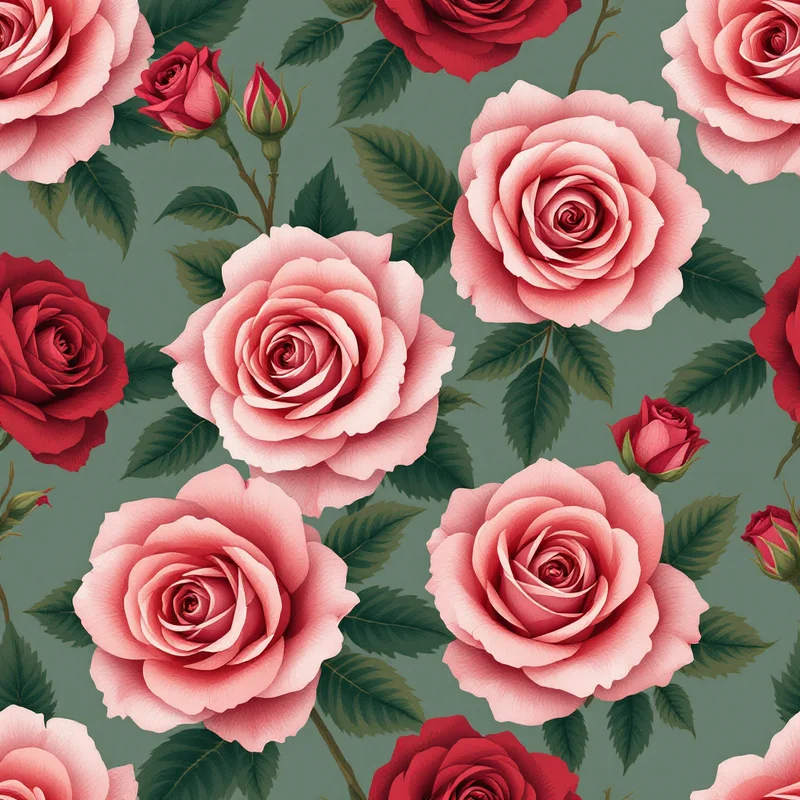
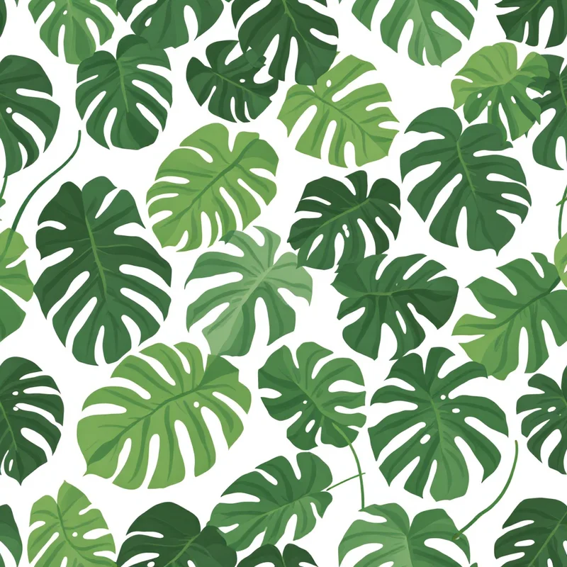
Botanical patterns on emerald read as luxurious rather than naturalistic. The color elevates plant imagery from documentary to decorative. Detailed botanical illustrations, climbing vines, leaf arrangements, and floral patterns all appear richer and more sophisticated on emerald than on lighter green backgrounds. The motif gains visual weight and prestige from the color foundation.
Ornamental and Damask-Inspired Patterns
Emerald is the natural home for ornamental patterns that reference damask, chinoiserie, or Baroque traditions. Elaborate curving forms, symmetrical medallions, repeating ornaments — these traditional pattern structures read their most opulent on emerald. The color provides the richness that ornamental forms suggest.
Metallic and Gold-Accented Patterns
Emerald + gold is one of the most commercially successful color combinations in luxury design. Patterns that incorporate gold accents, metallic details, or gold-rendered elements achieve their maximum impact on emerald. The contrast between the deep jewel tone and the luminous metallic creates visual excitement while maintaining sophistication.
Geometric and Art Deco Structures
While emerald is traditionally paired with ornamental patterns, contemporary designers are successfully applying emerald to geometric and art deco structures. Clean lines and precise geometry on emerald read as intentionally modern. This approach works particularly well in branding and contemporary luxury applications.
Abstract and Gestural Patterns
Emerald provides a powerful foundation for abstract work — gestural mark-making, abstract florals, contemporary compositions rendered in complementary colors. The emerald background provides richness and visual weight that the abstract forms build upon. This approach is increasingly popular in contemporary fashion and home furnishings.
Subtle Texture and Tonal Variation
Like terracotta, emerald benefits from implied surface variation. Subtle texture, tonal mottling, or hand-drawn quality enhances the luxury impression. A perfectly smooth emerald can feel artificial. Slight variation — speckles, watercolor-like transitions, or organic edge quality — communicates hand-work and craftsmanship.
Color Palettes That Complement Emerald
Emerald's saturation is both a strength and a limitation — it requires careful supporting color choices to read as cohesive rather than chaotic. Understanding these dynamics is essential for commercial success.
Emerald + Gold: The definitive emerald combination. Gold provides warm luminosity that contrasts gorgeously with the cool emerald. This pairing dominates luxury packaging, wallpaper, fashion, and branding. The combination reads as regal and timeless. Gold can be rendered as warm yellow, metallic gold, or rose gold depending on sophistication level desired.
Emerald + Ivory: The subtler, more refined emerald pairing. Ivory (warm off-white) provides breathing room and allows emerald patterns to dominate without overwhelming. This combination works particularly well for wallpaper, textiles, and interior applications where visual rest is necessary. The palette feels elegant and understated.
Emerald + Blush Pink: A contemporary, romantic pairing that softens emerald's intensity. Blush (pale pink, dusty rose) against emerald creates unexpected harmony. This combination appears increasingly in fashion textiles and luxury home décor. The palette feels modern rather than traditional.
Emerald + Deep Navy or Black: A high-contrast approach. Navy or black provides dramatic opposition and creates visual punch. This pairing works in bold statements — contemporary packaging, fashion, branding applications. The palette reads as intentionally dramatic.
Emerald + Cream: Similar to ivory but slightly warmer. Cream creates warmth against emerald cool while providing clear separation. Works well in botanical and ornamental patterns where detail clarity matters.
Emerald + Deep Teal or Peacock: An advanced monochromatic approach using teal (blue-green) as a supporting color. This creates jewel-tone harmony and visual richness without relying on warm metallics. The palette feels contemporary and sophisticated.
Commercial Applications for Emerald Patterns
Emerald patterns have found enormous commercial traction across luxury and prestige applications. The color's inherent association with value makes it commercially viable across unexpected categories.
Fashion and Luxury Apparel
Emerald is one of the most specced colors in luxury fashion. Emerald seamless patterns appear on evening wear, contemporary dresses, scarves, and accessories. The color photographs beautifully and reads as high-value in both digital and printed marketing contexts. Luxury brands frequently release emerald pattern collections as signature offerings.
Wallpaper and Interior Design
Emerald wallpapers with botanical, ornamental, or geometric patterns are experiencing sustained demand from interior designers. Emerald feature walls are particularly popular in hospitality, commercial design, and high-end residential. The color anchors a room and reads as intentional rather than trendy.
Premium Packaging and Cosmetics
Emerald is a prestige color in cosmetics, fragrance, and luxury goods packaging. Emerald seamless patterns on box design, label work, or promotional materials communicate luxury and justify premium pricing. Beauty brands particularly favor emerald for skincare and prestige fragrance categories.
Stationery and Paper Goods
Emerald stationery, luxury paper stocks, and printed invitations leverage the color's premium associations. The color photographs beautifully in print and reads exceptionally well in foil stamping applications. Wedding invitations, high-end business stationery, and publishing design frequently incorporate emerald patterns.
Branding and Logo Applications
Forward-thinking brands in luxury, lifestyle, and prestige categories have adopted emerald as primary brand color. Emerald brand guides often incorporate seamless patterns that reinforce brand positioning. The color works in digital and print contexts and photographs well in lifestyle marketing.
Hospitality and Commercial Interiors
Boutique hotels, restaurants, and high-end commercial spaces frequently specify emerald patterned wallcoverings, upholstery, or custom finishes. The color creates sophisticated, memorable environments. Emerald patterns in hospitality communicate attention to detail and investment in design.
Designing Emerald Seamless Patterns
Creating compelling emerald patterns requires technical accuracy and understanding the color's interaction with supporting hues. The challenge is leveraging emerald's inherent luxury without allowing it to overwhelm.
Saturation and Lightness Precision
Emerald must be rendered at precisely the right saturation and lightness to read as jewel-toned rather than artificial or dull. Slightly desaturated and the color loses its opulent character. Slightly lightened and it reads as generic green rather than emerald. When designing, render your emerald at multiple saturation and lightness levels to ensure you have achieved true emerald rather than a variant.
Contrast and Figure-Ground Clarity
Emerald patterns benefit from clear visual separation between motif and background. If using complementary supporting colors (like gold), ensure sufficient contrast that the motif reads distinctly. Emerald's saturation can overshadow delicate pattern details if contrast is insufficient.
Density and Motif Complexity
Emerald patterns tend to read successfully at medium to high density, similar to terracotta. The color's richness supports detailed, complex motifs. However, intentional sparsity can also work — a single line motif on emerald creates drama and minimalist luxury. Test multiple density levels.
Suggested Generation Approach
Using Pattern Weaver's color palette system, select or create a true emerald green, then choose ornamental, botanical, or geometric substyles that align with your luxury positioning. The platform's preset emerald palettes include natural supporting colors like gold, ivory, and blush. Generate variations at different complexity and density levels. Evaluate which motif clarity and density creates the luxury impression your application requires.
Material and Production Considerations
Emerald requires accurate color management in production. Digital screen rendering and printed output often differ significantly. If the final application involves textile printing, cosmetic packaging, or other color-critical work, obtain physical color samples and production proofs. Emerald's blue undertone can shift under different lighting and printing processes.
Emerald in Contemporary Design
Emerald's prominence in 2026 design reflects broader trends toward saturated color and opulent aesthetics. Following decades of minimalism and neutral palettes, audiences are increasingly receptive to rich, confident color application.
The Saturation Shift
Contemporary design is moving away from muted, desaturated palettes toward richer colors. Emerald exemplifies this shift — it is vivid, confident, and unapologetic. Brands are using saturated colors like emerald to differentiate themselves and communicate premium positioning.
Luxury Democratization
While emerald has always been a prestige color, contemporary applications have made it more accessible. Emerald patterns appear in mid-market fashion, home furnishings, and lifestyle products alongside traditional luxury applications. This broader adoption has kept emerald commercially relevant.
Jewel-Tone Trending
The broader color story favors saturated jewel tones — emerald, sapphire, ruby, amethyst. These colors reference luxury, rarity, and value. Brands across categories are incorporating jewel tones to signal quality and invest in visual distinctiveness.
Sustainability Narrative
Emerald's association with nature and precious materials aligns with contemporary sustainability messaging. Brands can position emerald patterns as connected to natural beauty while acknowledging the luxury and rarity positioning the color communicates.
Emerald seamless patterns endure because they operate on multiple levels simultaneously — they communicate luxury through hue alone, they provide sufficient visual weight to support complex patterns, and they remain commercially relevant across unexpected applications. The color itself does substantial work, which means patterns can be either ornate and detailed or clean and minimal. That versatility, combined with the color's inherent prestige, makes emerald one of the most reliably successful colors in luxury pattern design.
Explore related pattern styles
