


Design characteristics
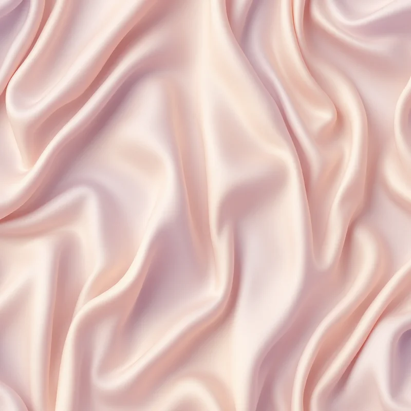
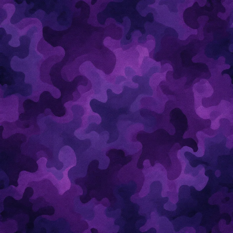
The visual hallmarks are consistent: a directional sheen, fine vertical or swirling pile texture, and a deep saturation that makes colors look heavier and more pigment-rich than they would on cotton or paper. Classic velvet motifs lean ornamental, often pairing the pile texture with damask scrollwork, baroque florals, paisley teardrops, or art deco fans, since the fabric has long been associated with formal and decorative interiors. Devore velvet in particular relies on a clear figure-and-ground contrast, so botanical silhouettes and stylized flowers translate especially well.
Commercial applications
Velvet has a long decorative lineage, woven in Kashmir and the Middle East before becoming a staple of Renaissance Italian and Ottoman court textiles, then Victorian upholstery and 1920s fashion. That heritage shapes the palette: jewel tones dominate, with emerald, sapphire, burgundy, plum, teal, and inky midnight blue carrying the richest sheen, while blush, champagne, dusty rose, and forest green suit softer contemporary interiors. Gold and bronze accents reinforce the opulent association.
Where to use velvet patterns for plush, light-catching surface design patterns
Designers reach for velvet patterns because they signal richness and comfort at once, which is why the look performs across so many products. In fashion, it drives evening wear, blazers, scarves, and accessories; in home decor, it defines throw pillows, headboards, curtains, and statement upholstery. Wallpaper and wall panels use large-scale velvet damask for feature walls, while packaging and branding borrow the deep sheen for cosmetics, jewelry boxes, wine labels, and gift wrap that need to feel premium in the hand. The same artwork can scale from a small jewelry-box wrap to a full sofa repeat without losing its plush character, which keeps a single design useful across an entire product line rather than a single item.
Customization & export
With Pattern Weaver you control the variables that make velvet convincing. Dial the density to move between sparse, breathing motifs and an all-over crush; adjust scale so the pile texture reads correctly whether the design sits on a clutch or a curtain panel; and steer the color so the sheen lands in the exact jewel tone or muted neutral your collection needs. Push the contrast for a sharp devore burnout, or soften it for a subtle tonal velvet that whispers rather than shouts. Because every tile is generated seamless, the repeat tiles cleanly across yardage, rolls, and large print runs with no visible seam, so you never have to hand-patch the edges before production.
When the design is right, Pattern Weaver exports it at up to 8K (8192x8192) in production-ready formats. Choose PNG for layered digital mockups, TIFF for textile and upholstery printing where color fidelity matters most, or PDF for press-ready packaging and wallpaper proofs. The result is a velvet look that keeps its depth and sheen from screen to finished product.