
Design characteristics
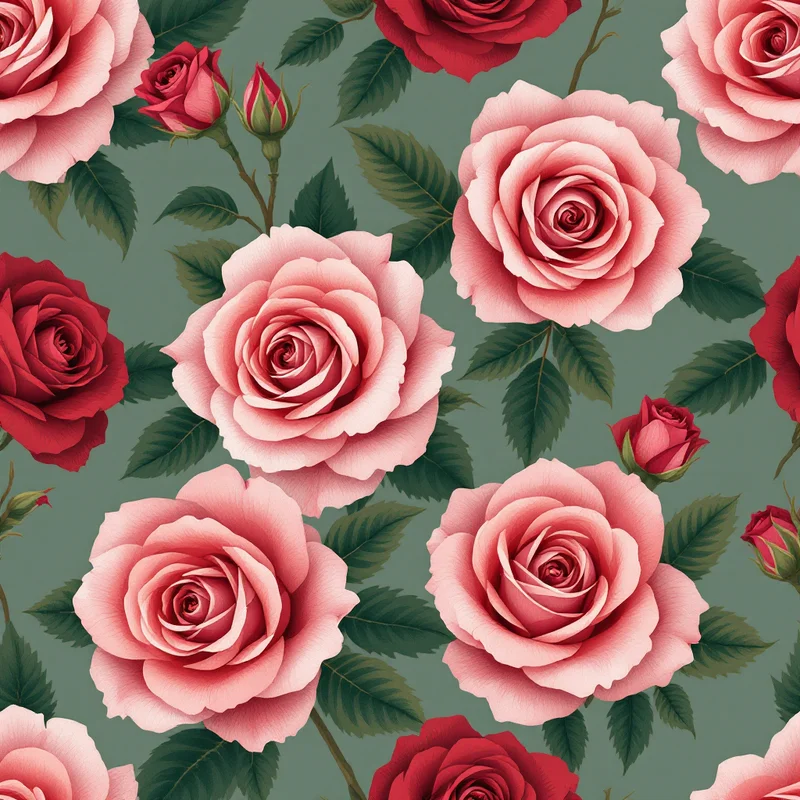
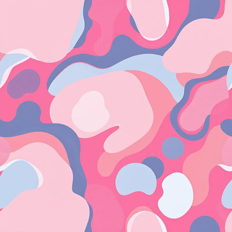
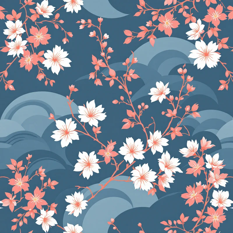
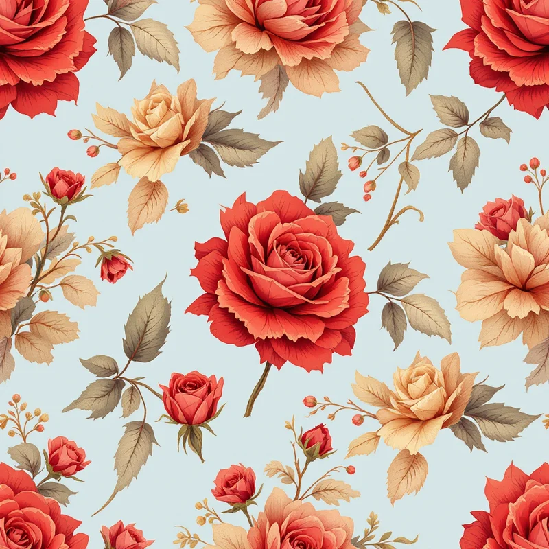
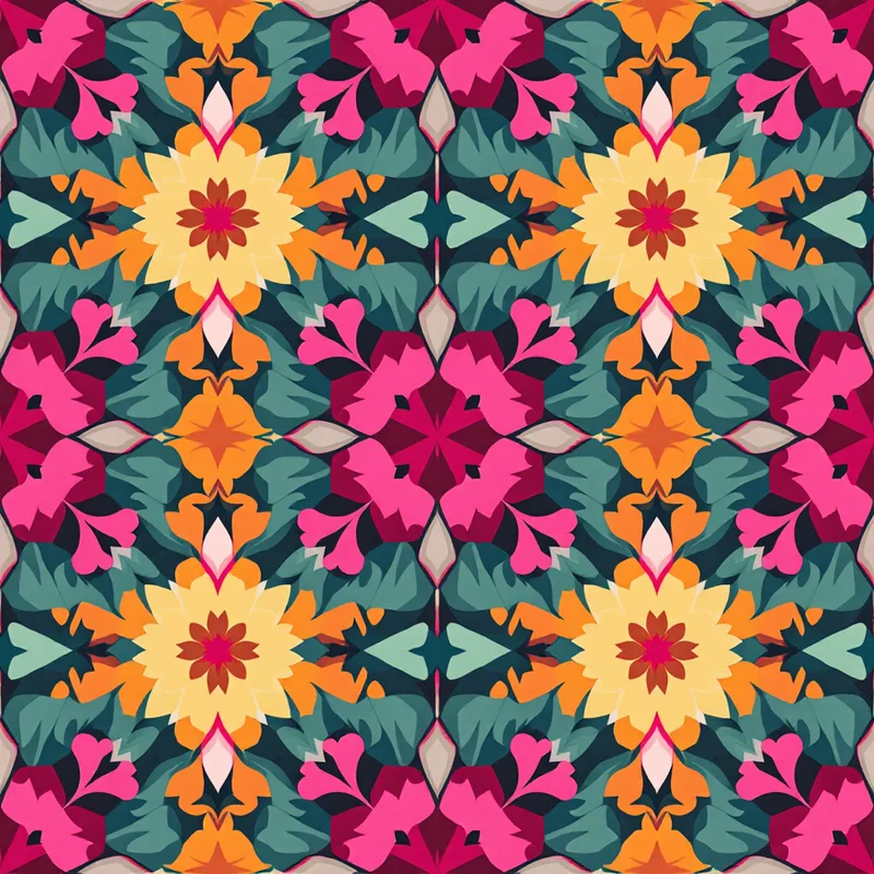
The visual hallmarks of pink patterns are tied closely to the motifs designers pair with the color. Soft pinks lean into florals such as peonies, cherry blossoms, roses, and ditsy scattered buds, often on cream or white grounds for a vintage or shabby-chic feel. Brighter pinks favor bold geometrics, polka dots, stripes, and abstract brushstrokes that play up the high energy of the hue. Mid-tones work beautifully in toile, damask, and paisley, where rose and mauve give traditional layouts a softer modern reading. Monochrome pink-on-pink tonal patterns, where motifs sit only a shade or two away from the background, have become a signature of the millennial-pink moment and remain a strong fashion and interiors trend.
Commercial applications
Historically, pink earned its decorative footing in 18th-century European textiles and Rococo interiors, where rose and shell tones signaled refinement, and again in mid-century America, where powder pink defined a whole era of homeware and fashion. Today the color carries cultural weight from sakura motifs in Japanese design to the saturated pinks of South Asian textiles, giving designers a deep well of references to draw on.
Where to use seamless pink patterns for fabric, print, and decor patterns
Designers reach for pink patterns because they sell across an unusually broad market. The same rose floral can anchor a quilting cotton collection, a wedding stationery suite, and a cosmetics box, while a hot-pink abstract repeat can carry activewear, phone cases, gift wrap, and accent wallpaper. Pink performs especially well in print-on-demand, beauty and wellness branding, kids and baby goods, soft furnishings, scarves, and packaging where shelf appeal matters. Because pink reproduces cleanly in both screen and print workflows, it bridges digital products and physical goods without color drift when managed carefully.
Customization & export
Pattern Weaver lets you dial in the exact pink you need rather than settling for a preset. You control the palette down to specific blush, coral, or fuchsia values, adjust motif density from airy and sparse to dense and immersive, and set the scale so the same design reads correctly on a fingernail-sized icon or a full bolt of fabric. You can mix pink with neutrals, golds, or contrasting brights, then preview the seamless repeat to confirm the tile lines up with no visible seams.
Once a design works, export it the way your production needs it. Pattern Weaver outputs up to 8K resolution (8192x8192) in PNG, JPG, WEBP, TIFF, PDF, and SVG, with print-ready options for fabric and packaging vendors. That means one pink pattern can move straight from the studio to a print-on-demand storefront, a wallpaper mill, or a manufacturer's spec sheet without rebuilding the file, so your color and scale decisions carry through every product they touch.